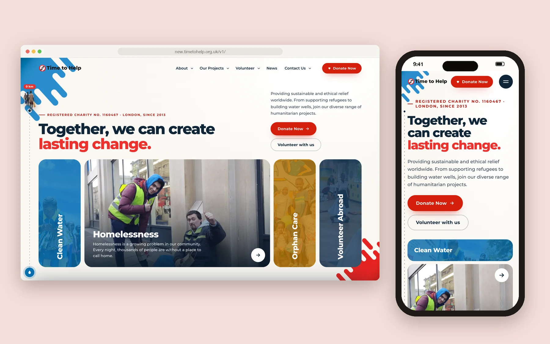
Time To Help UK — 2026Web UI / UX Design (V3)
My role
- Problem research
- UX & UI design
- Visual language & humour
- AI-assisted WordPress / Elementor build
Year
2026
Discipline
Version
V3 · after the 2023 redesign
Platform
WordPress · Elementor
Tools
In 2026 Time to Help UK’s website needed a new version. I found the problems first, designed the solutions myself, and then turned the designs into WordPress and Elementor pages with AI.
Problems first
Before designing anything, I listed what was wrong. Plugins like Revolution Slider were slow and left no freedom in the design. Over the years the site had become crowded; it no longer looked good on phones and the layouts were breaking. The design language wasn’t effective, and speed was suffering badly.
I solved the most important problems first and built the new site on top of those fixes.
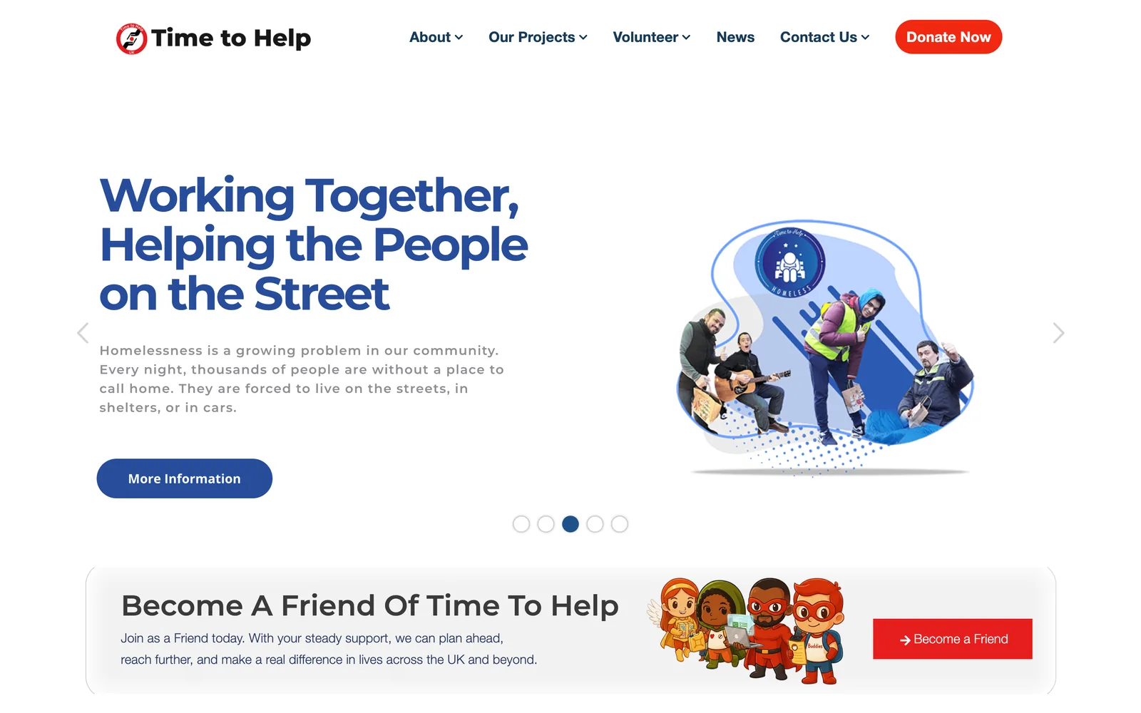
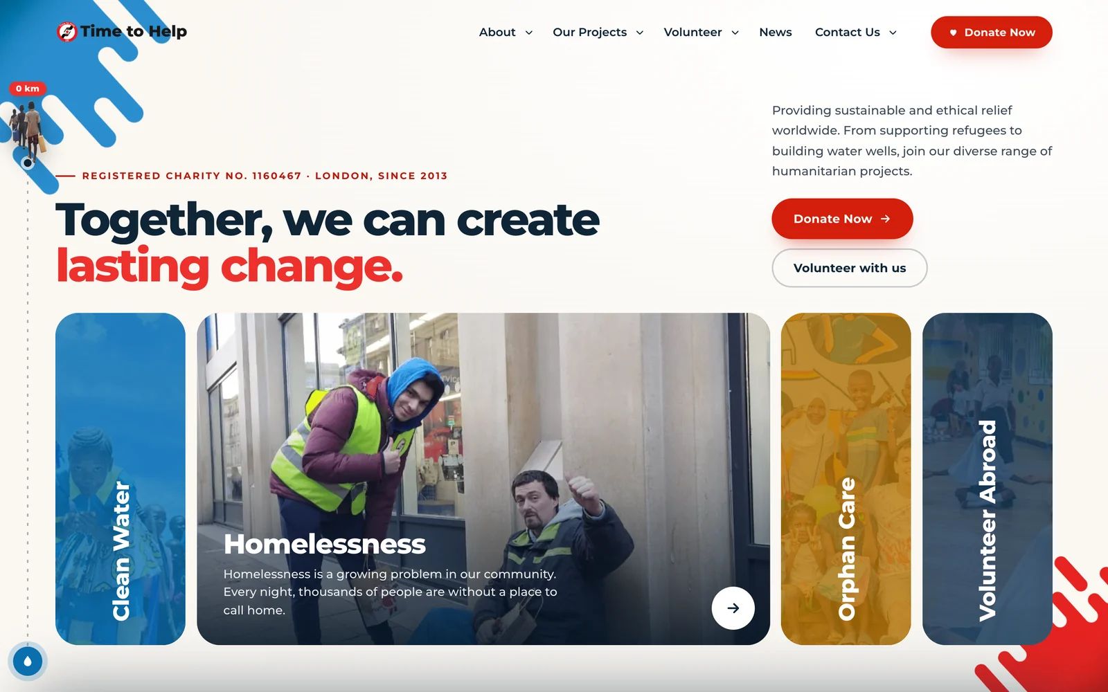
Homepage — drag to compare
Fast now
With AI’s help every image was resized and compressed to the size it is actually shown at, and the site’s architecture was planned around that. The new site is very fast.
The homepage
The projects I wanted to highlight are presented as cards, and the project detail pages are much more minimal.
A little humour on the side
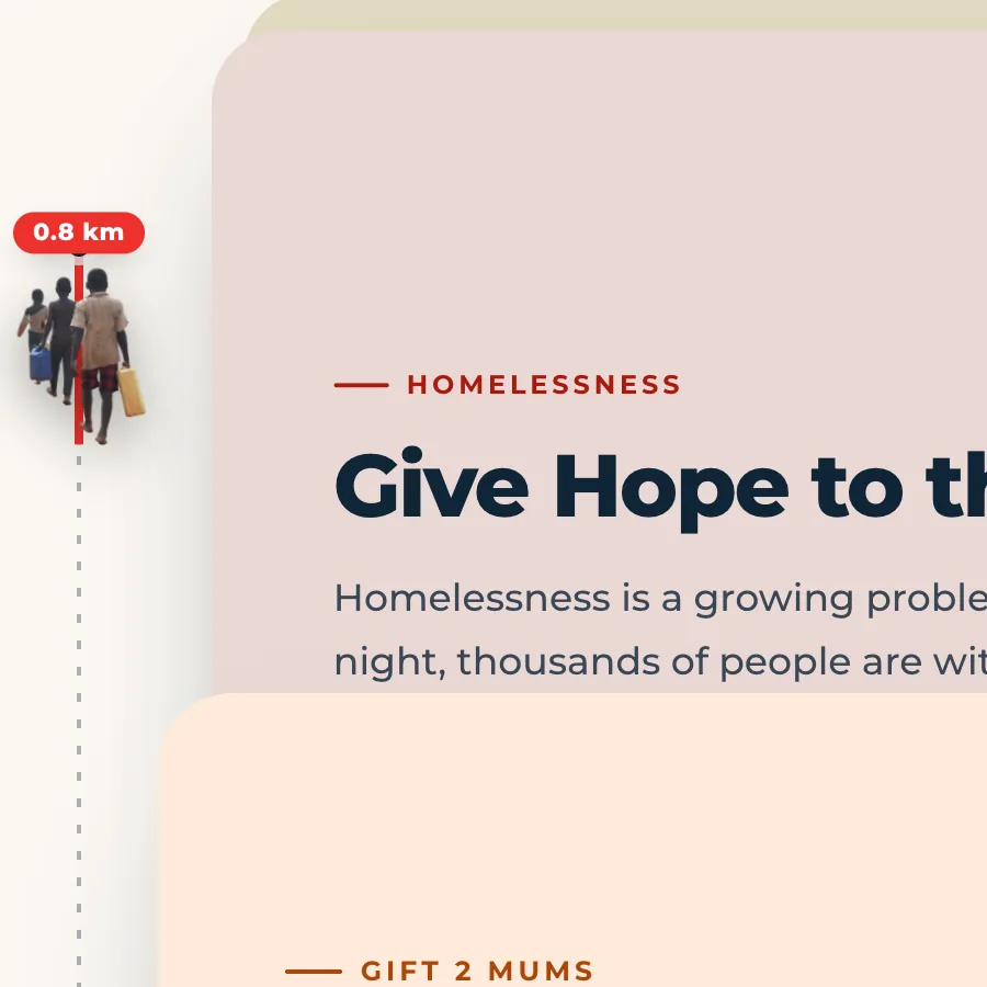
Small jokes live on the left edge. As you scroll, a family walks down the page carrying water and a counter adds up the kilometres — a nod to Walk2Water and its 6 km walk.
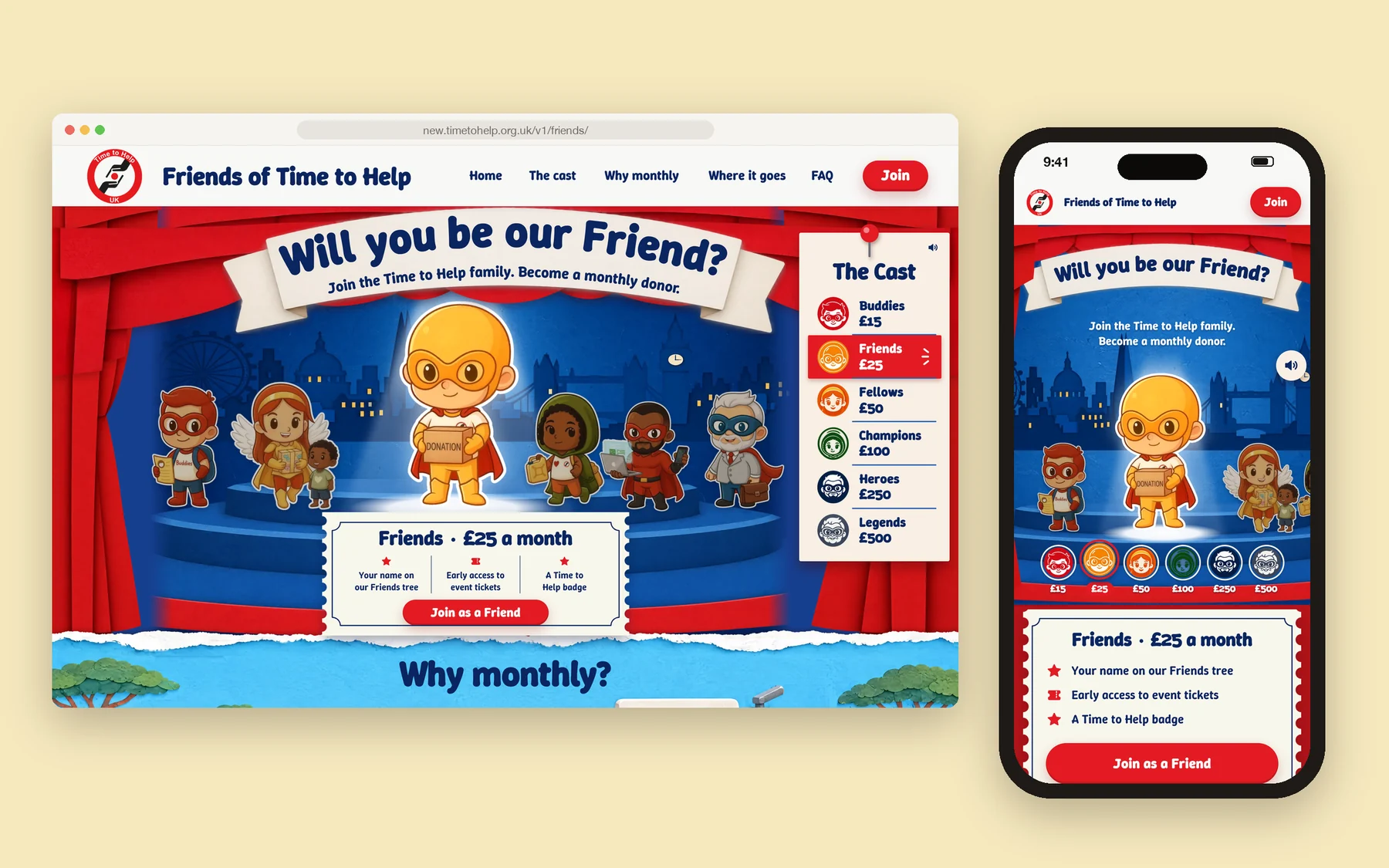
Friends of Time to Help
Some pages got a fun visual language of their own. Friends of Time to Help, the page for monthly donors, is one of them.
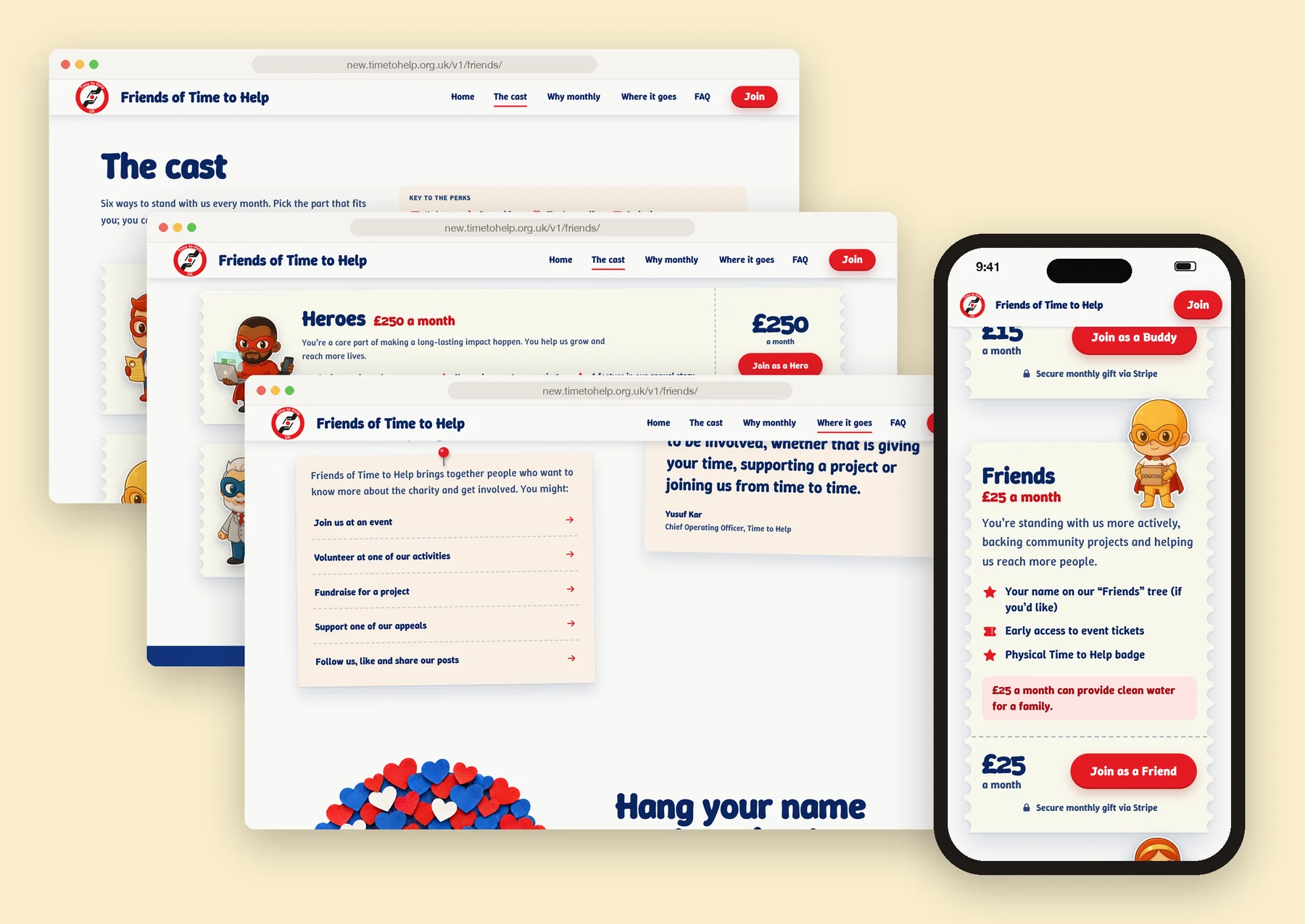
Six ways to be a Friend
From Buddies to Legends, every monthly level has its own character, and every Friend can hang their name on the Friends tree.
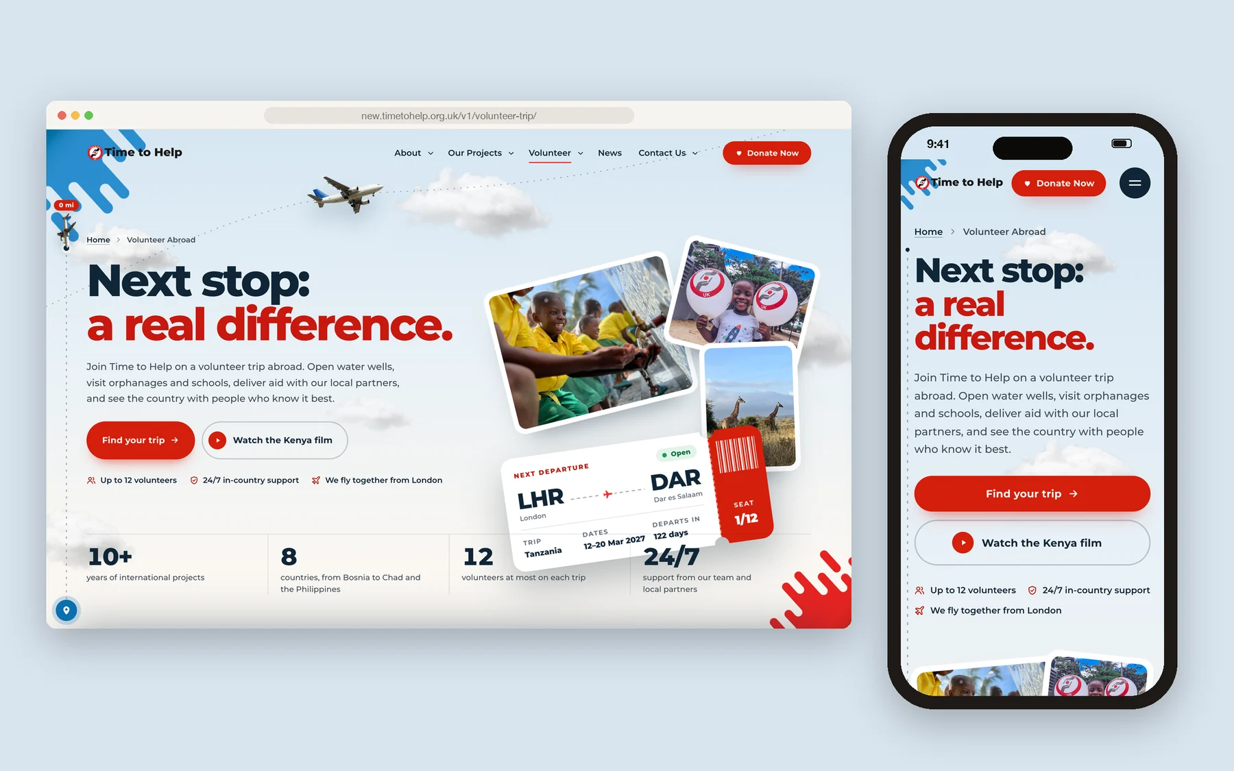
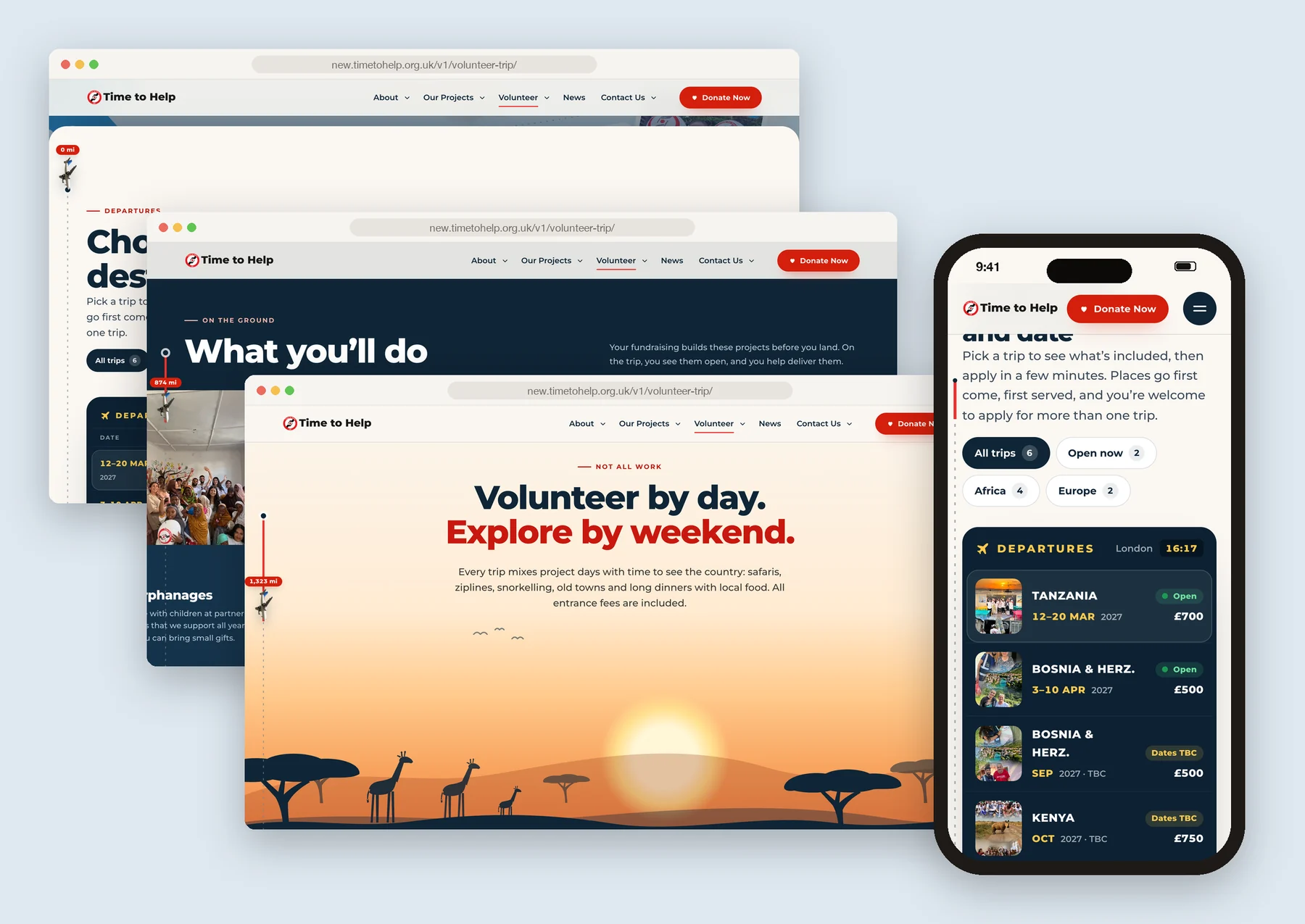
Volunteer trips, in detail
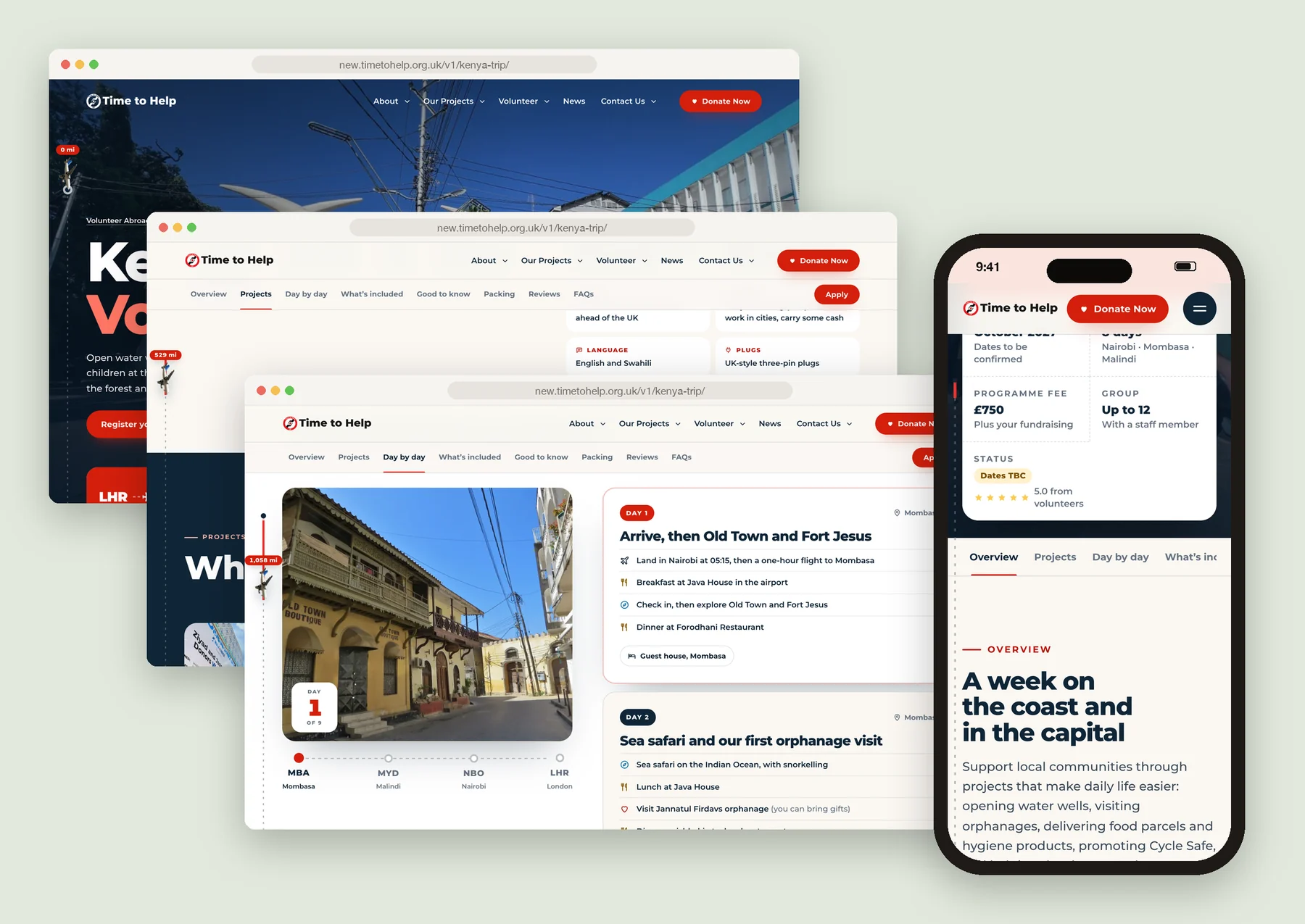
Volunteer Abroad is one of the most used parts of the site, so it got its own lively language too, with every trip laid out in detail.
Departures, projects and weekends
Upcoming trips read like a departures board, followed by the work on the ground and what volunteers do at the weekend.
The Kenya trip
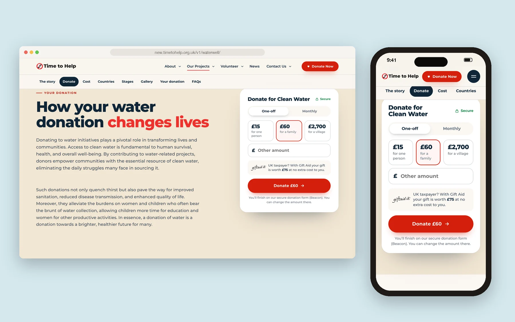
Giving, made simple
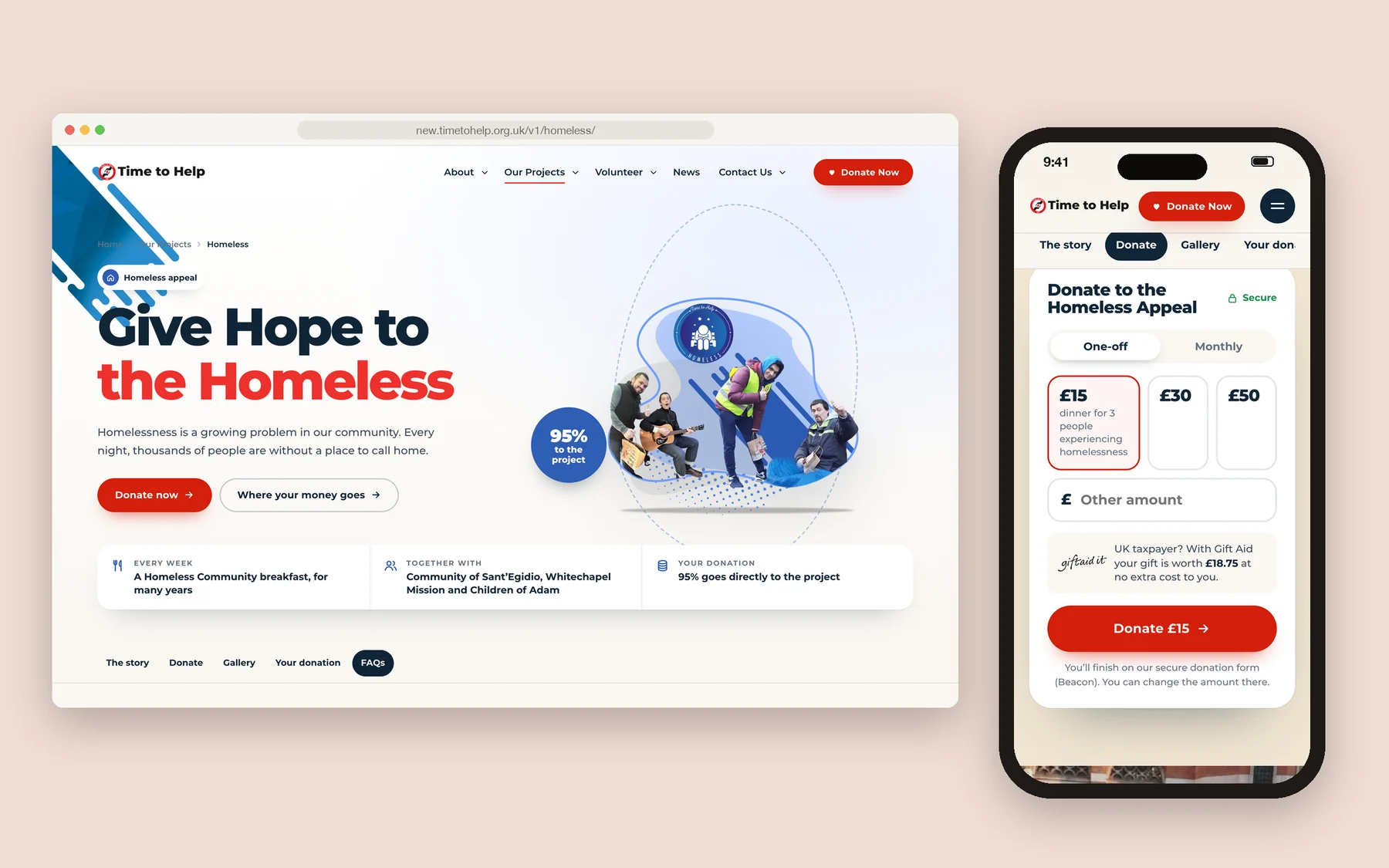
Every appeal page has the donation form right there: one-off or monthly, suggested amounts, Gift Aid and a single button.
Homeless appeal
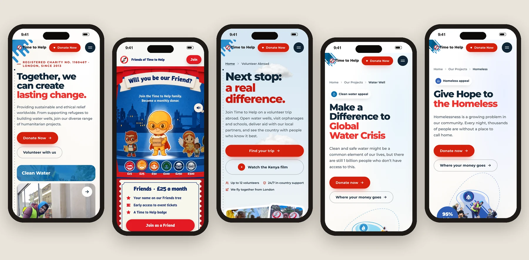
Phone first
The phone view came first: more minimal, and with more motion.
Designed by me, built with AI
I came up with the solutions and designed every page myself, then turned the designs into WordPress and Elementor pages with AI.
Next project