
TMSA Public CharterSchools — Logo &Brand Identity
My role
- Logo design
- Brand identity
- Brand guidelines
- Print & digital templates
- School catalogue
Year
2023
Discipline
Brand guide
21 pages
Catalogue
32 pages
Tools

TMSA Public Charter Schools is a network of non-profit public charter schools in North Carolina, focused on STEAM. I redesigned the logo from scratch, found the ideas behind it, and built the whole corporate identity and the guide that shows how to use it.
Old logo, new logo
The new logo was chosen by the school community itself: stakeholders voted between five different design proposals.
“TMSA” stands for “The Math and Science Academy”.
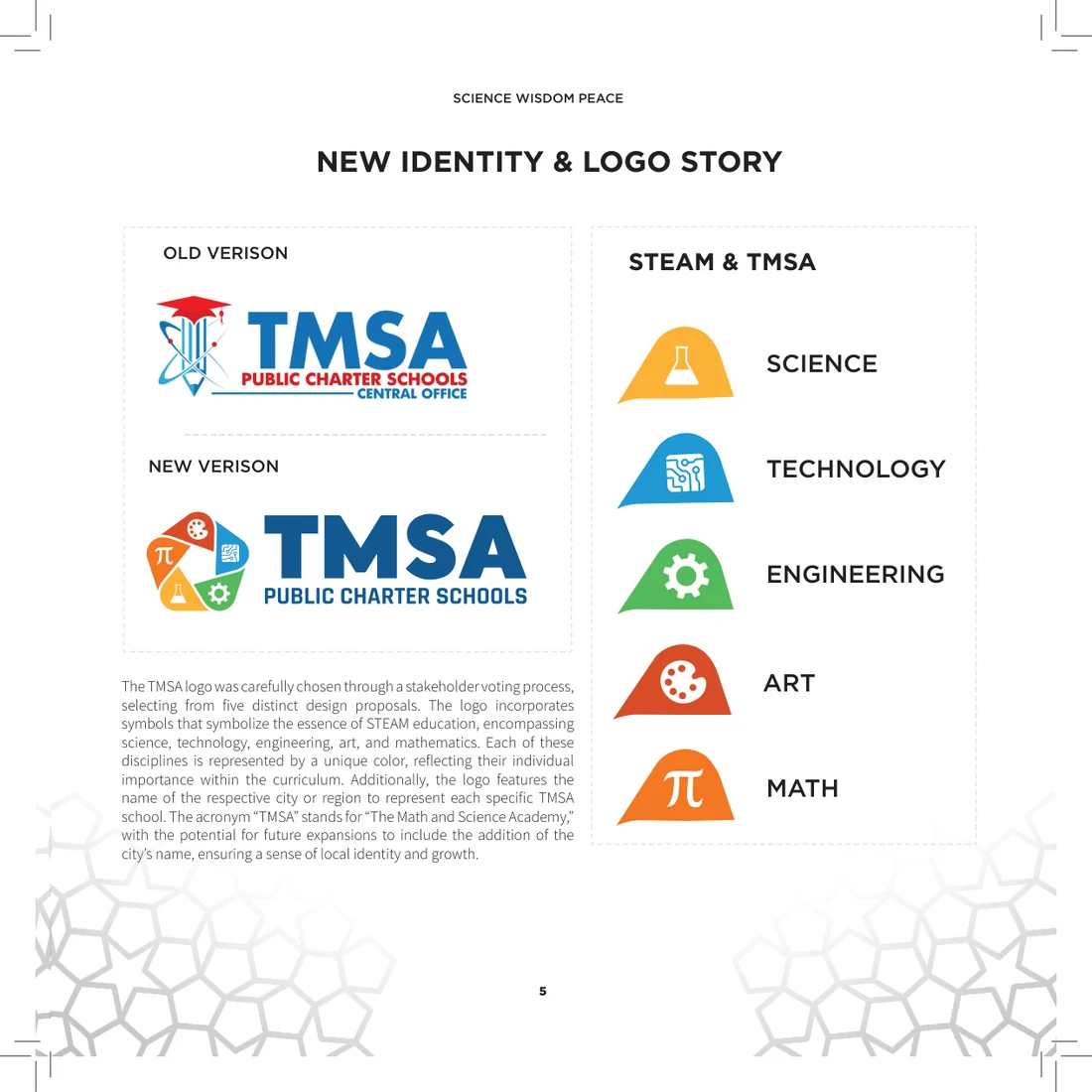
STEAM in one mark
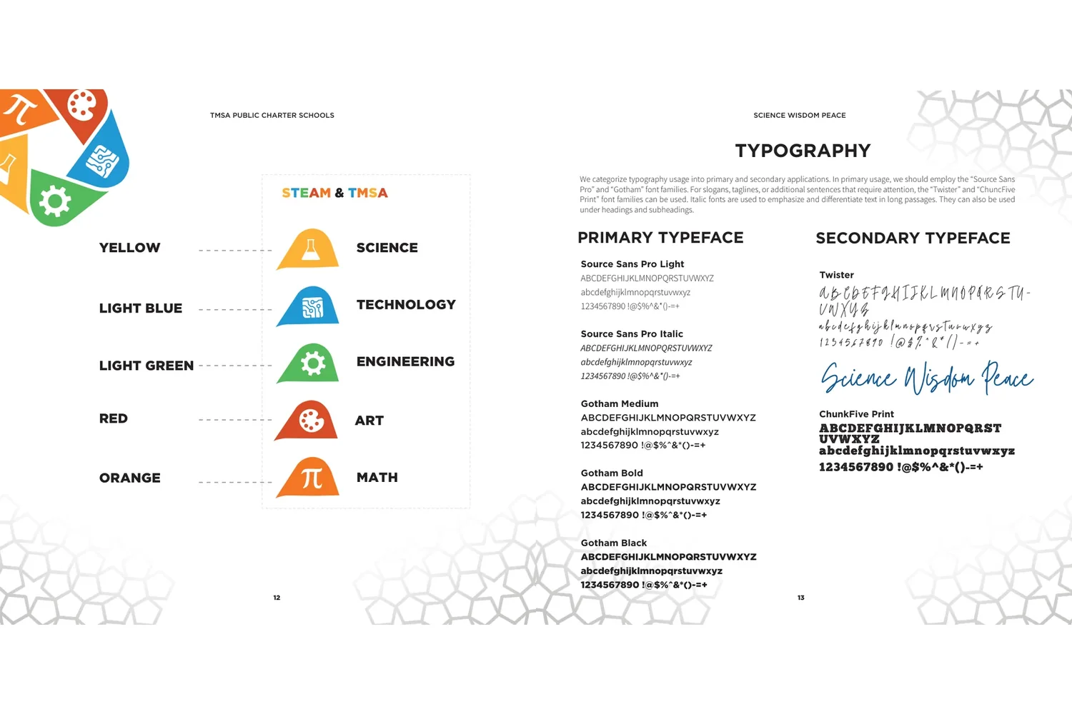
Science, Technology, Engineering, Art and Math each have their own symbol and their own colour, and together they make the mark. Under the name sits the motto: Science · Wisdom · Peace.
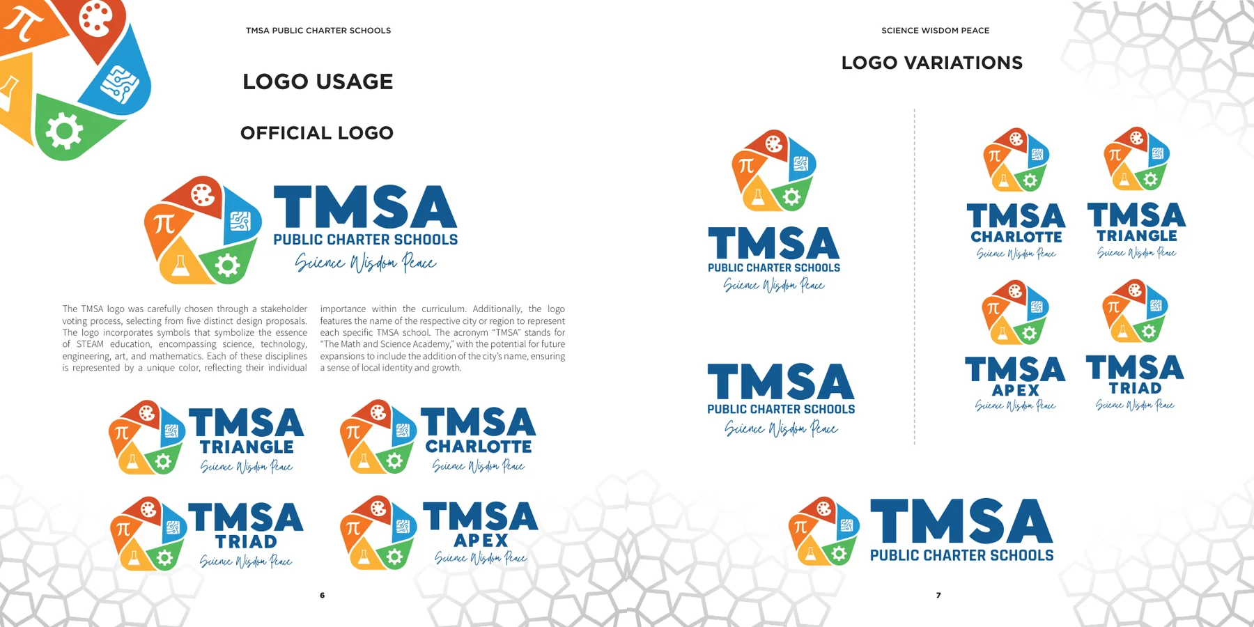
One family of schools
Every school carries the name of its city or region under the same mark — Charlotte, Triad, Triangle, Apex — and the system leaves room for the next one.
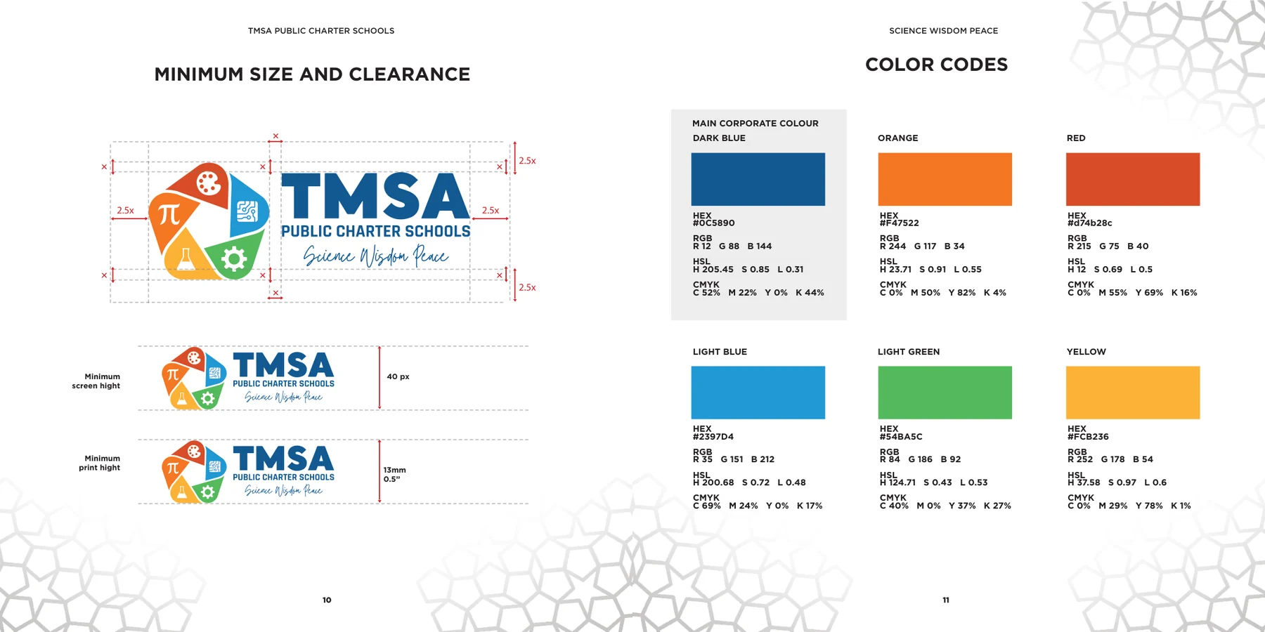
Colour, size and clear space
The guide fixes the colour codes, the smallest size the logo can be used at and the space it needs around it.
The brand guide
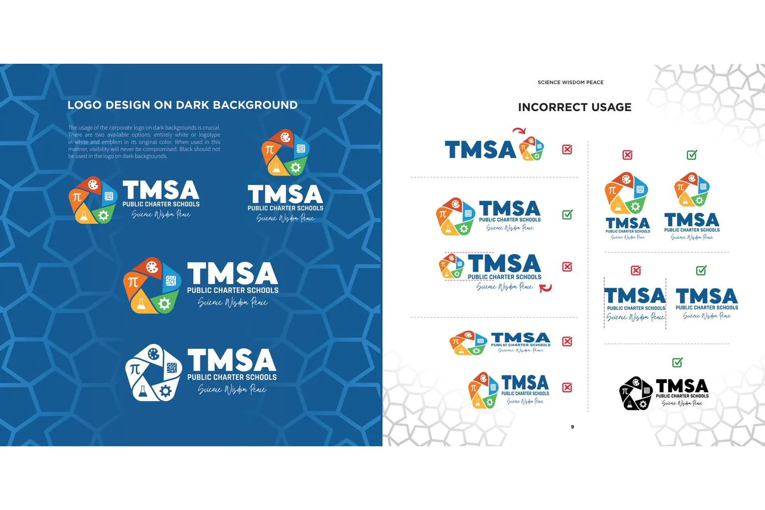
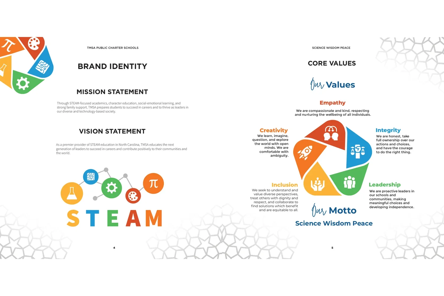
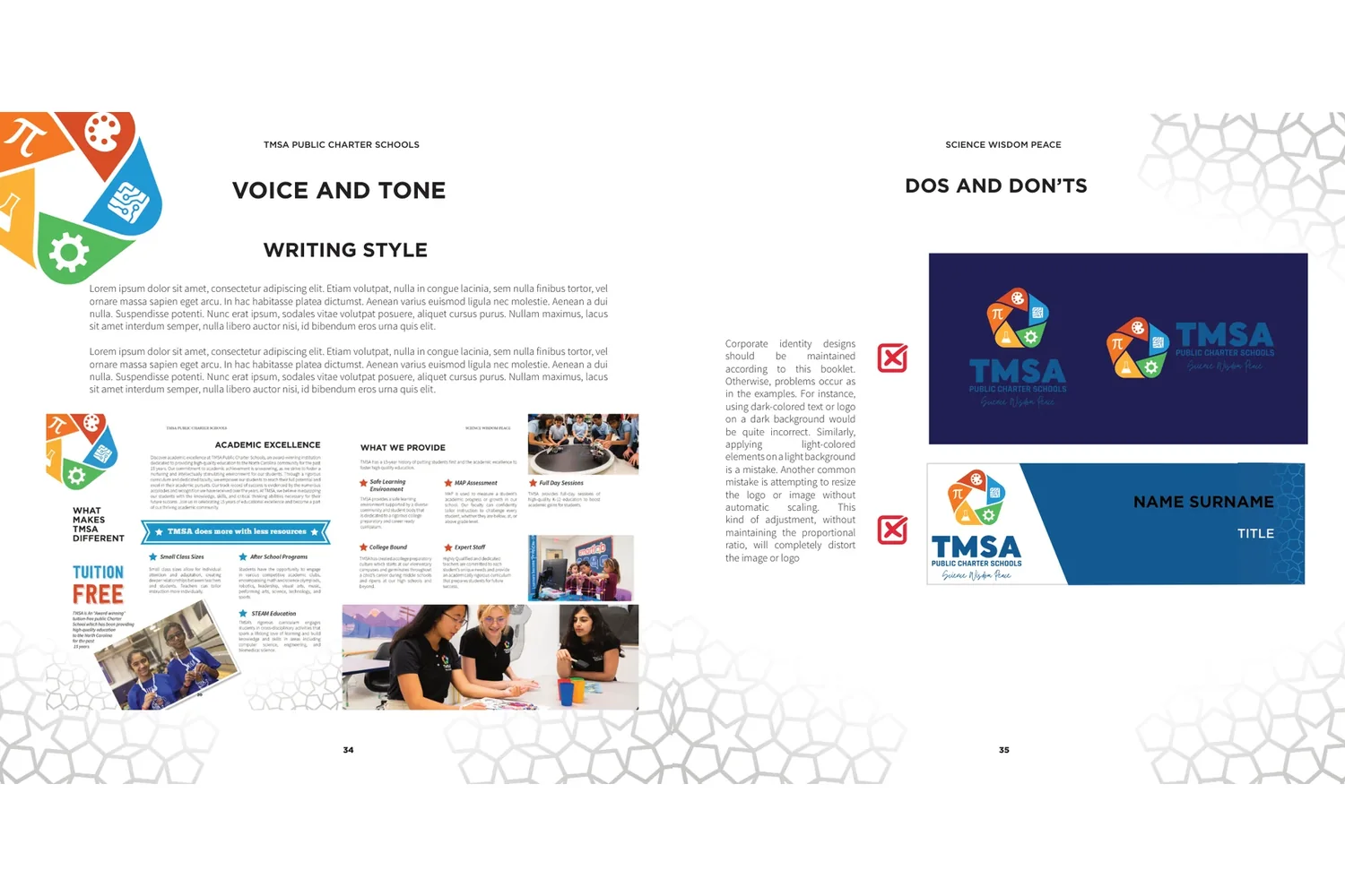
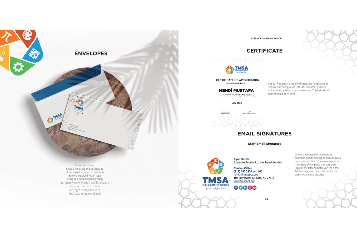
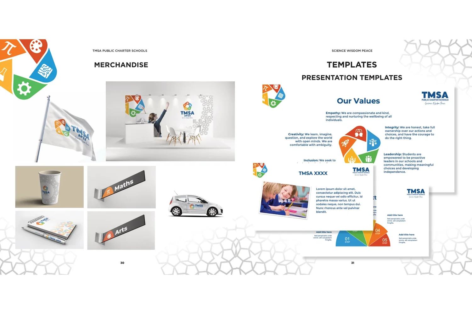
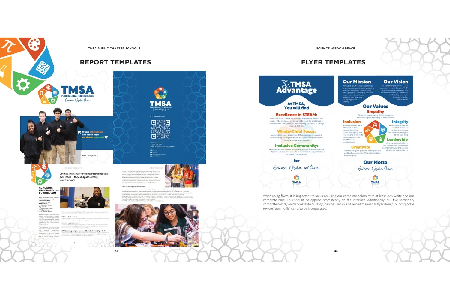
A 21-page guide explains how to use the identity: the logo and its versions, colour, type, voice and tone, dos and don’ts, and ready-made templates for everyday work.
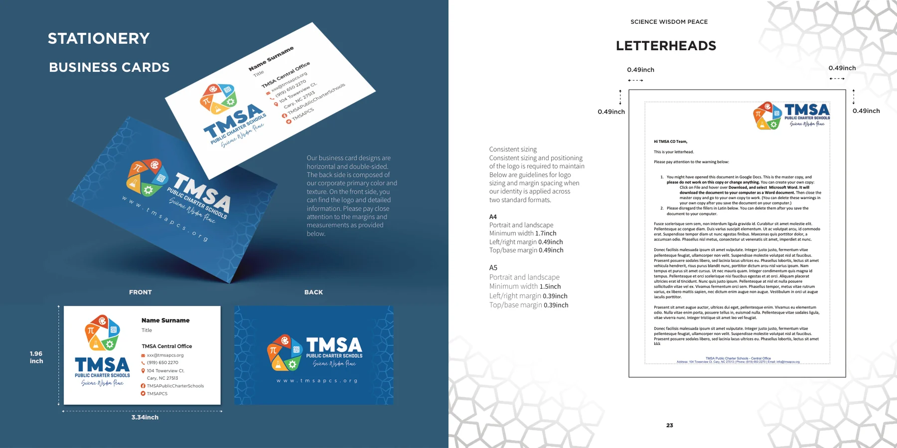
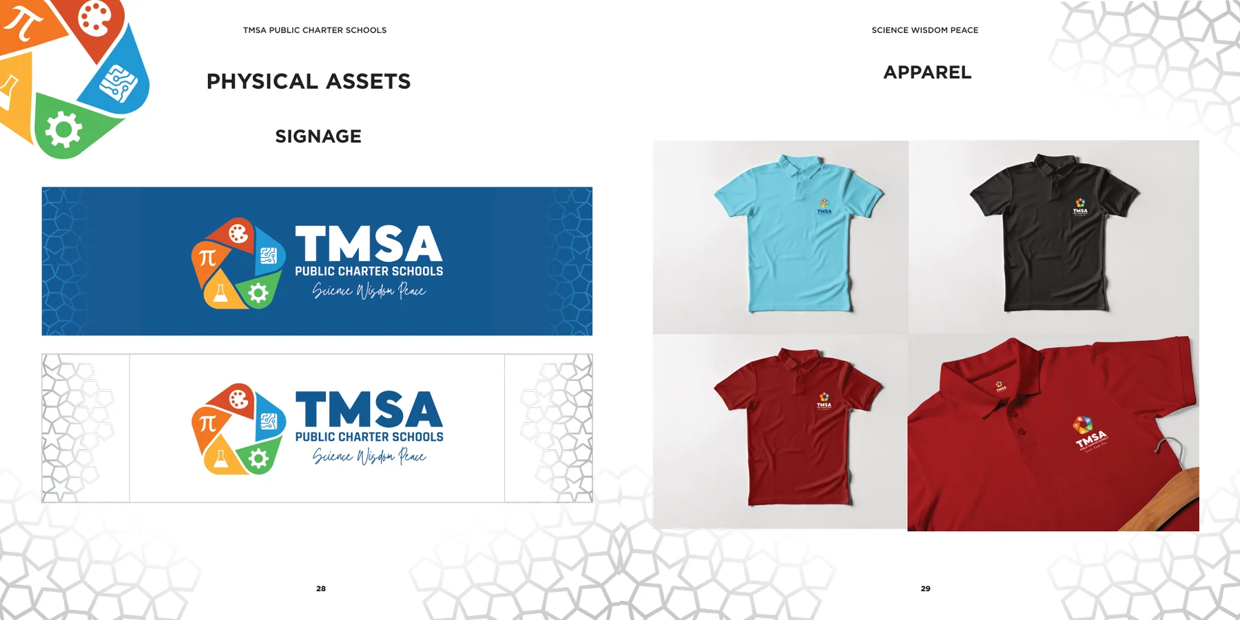
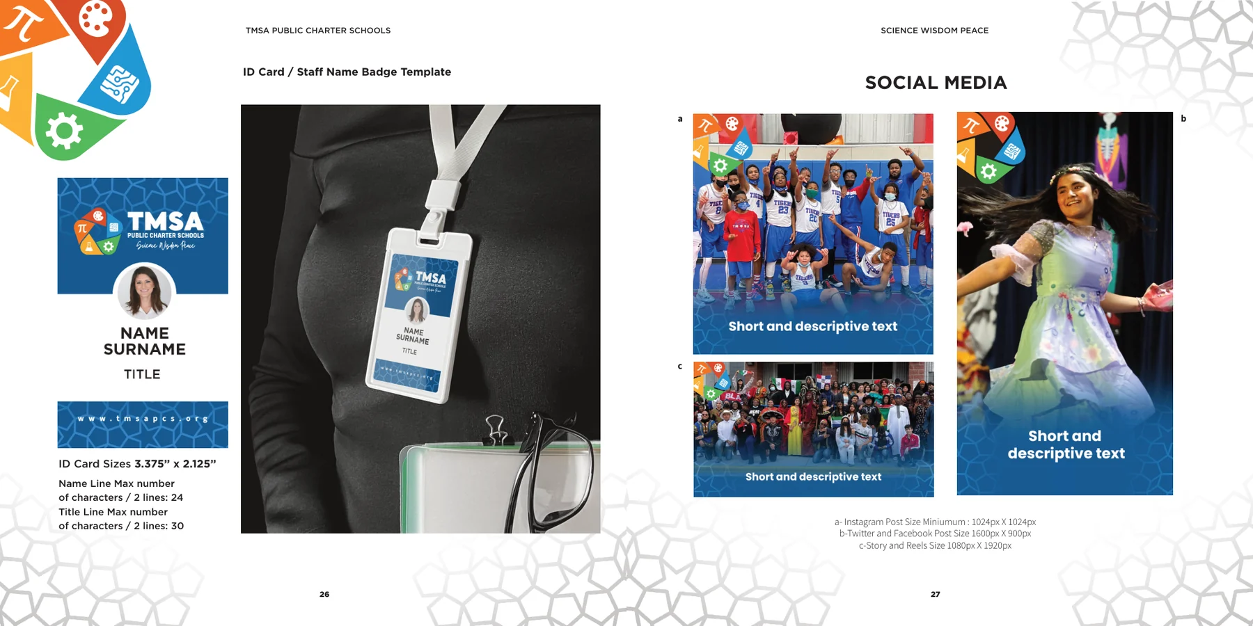
From business cards to signage
The identity runs through stationery, staff badges, signage, apparel and social media.
The school catalogue
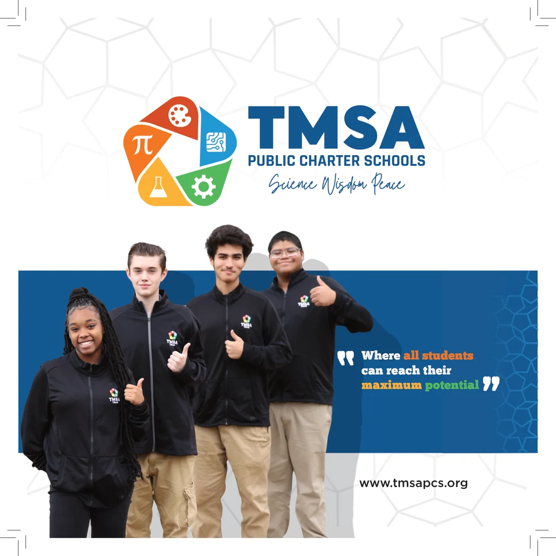
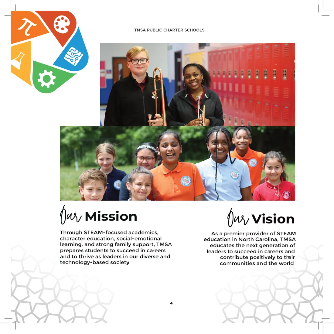
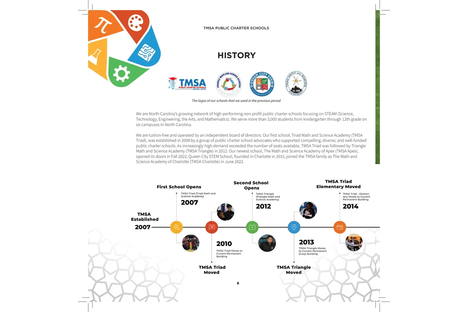
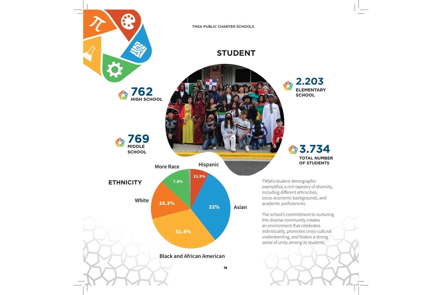
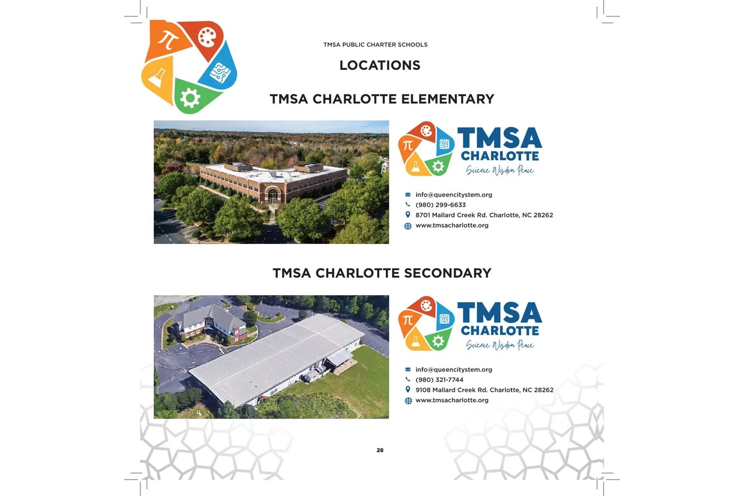
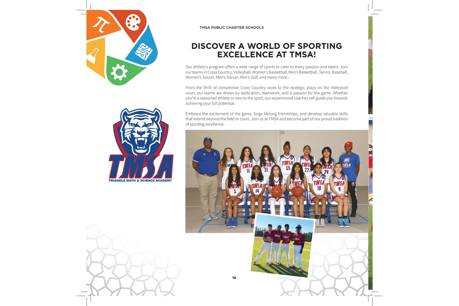
A 32-page catalogue carries the new identity into print: the schools’ mission and history, their students, locations and sports.
Next project