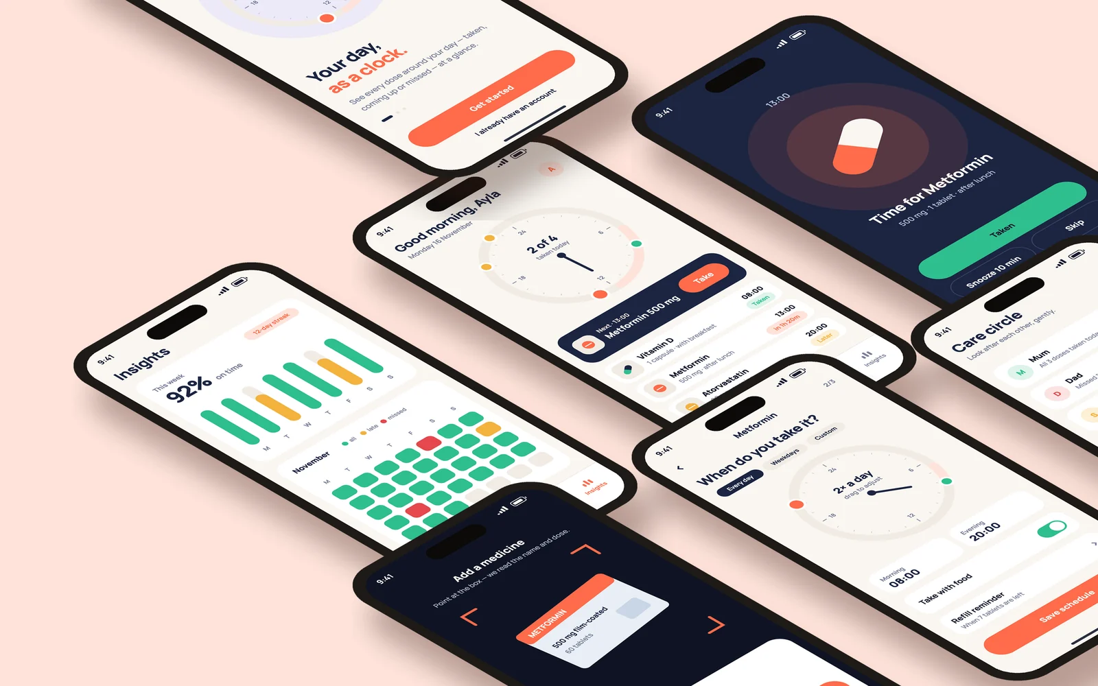
oclo — Pill Reminder App· Brand & UI/UX
My role
- Naming & logo
- Brand identity
- UX flows
- UI design
- Mockups
Year
2026
Discipline
Type
New brand · concept
Platform
iOS & Android
Tools
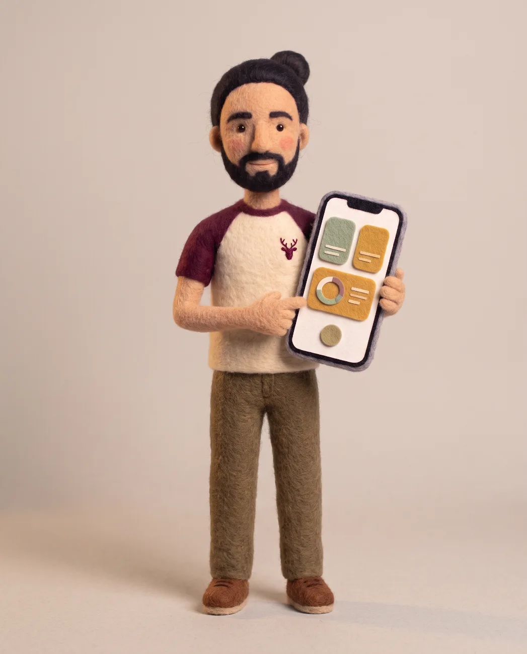
oclo is a new pill reminder app, imagined as a fresh challenger in a crowded category. It got a name, a logo and a complete app design — all made with AI.
A crowded shelf
Most pill reminders look like an alarm clock or a spreadsheet: a list of times and a ringtone. Alarms get dismissed, lists get ignored.
oclo starts from a different picture — your day as a clock, with every dose sitting on it.
The name and the mark
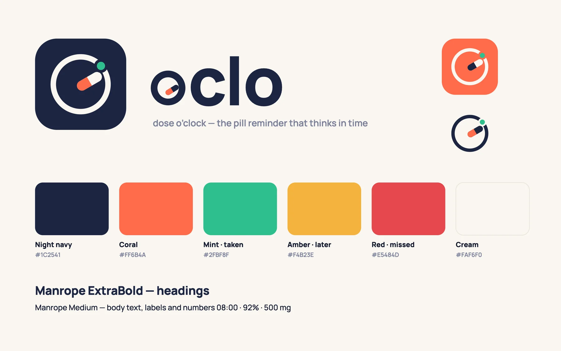
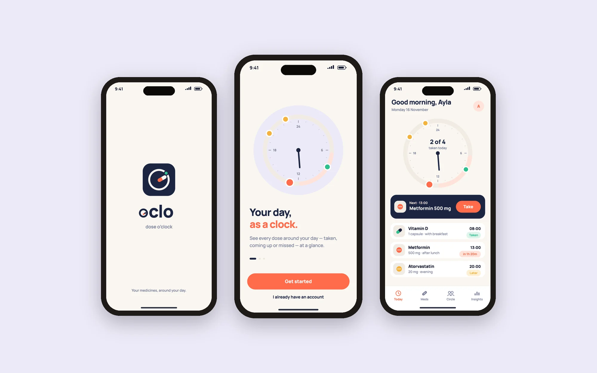
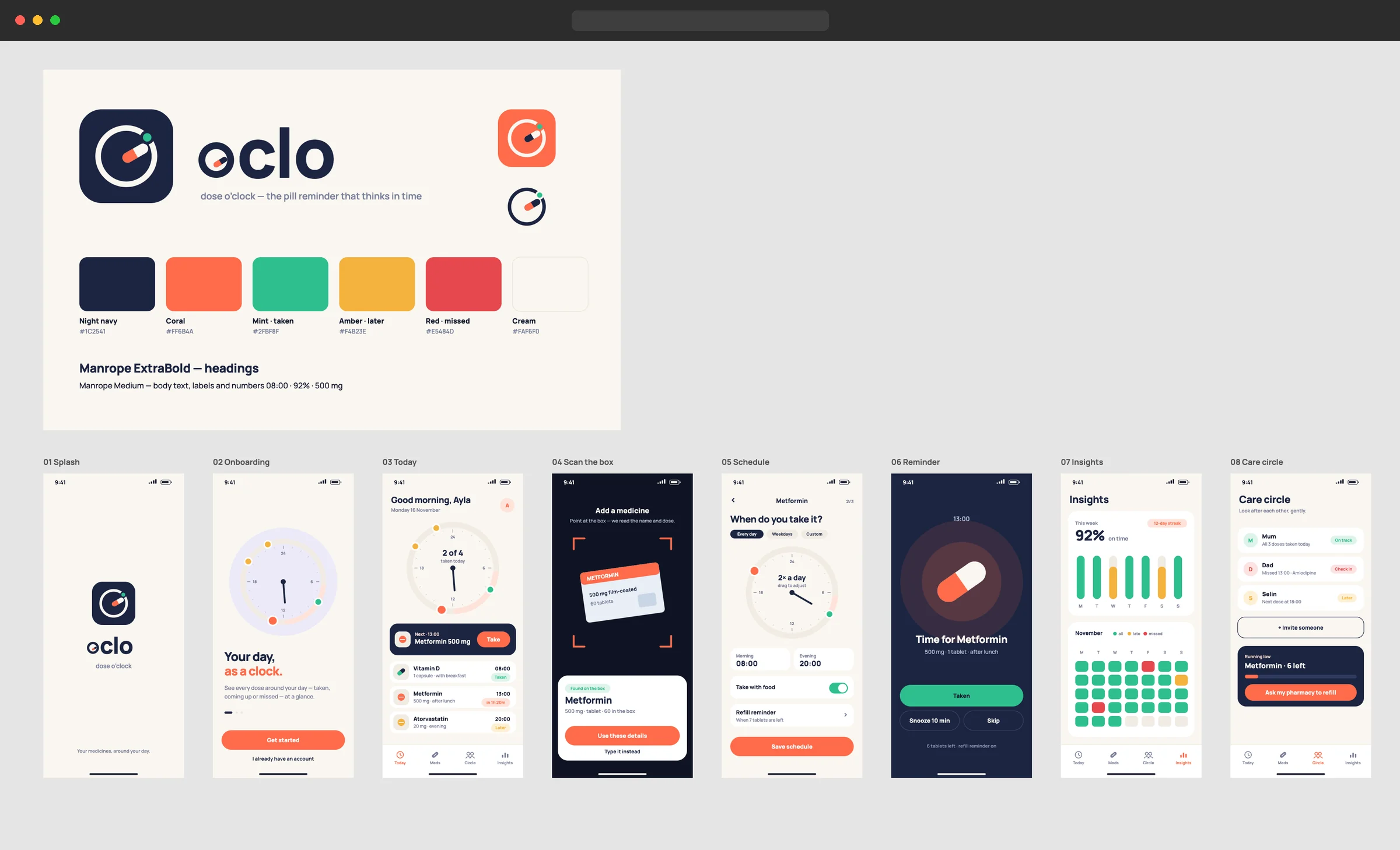
oclo comes from “o’clock”. The “o” of the wordmark is a clock whose hand is a capsule, and a small dot marks the next dose. Navy for calm, coral for “now”, mint for “taken”.
Your day as a clock
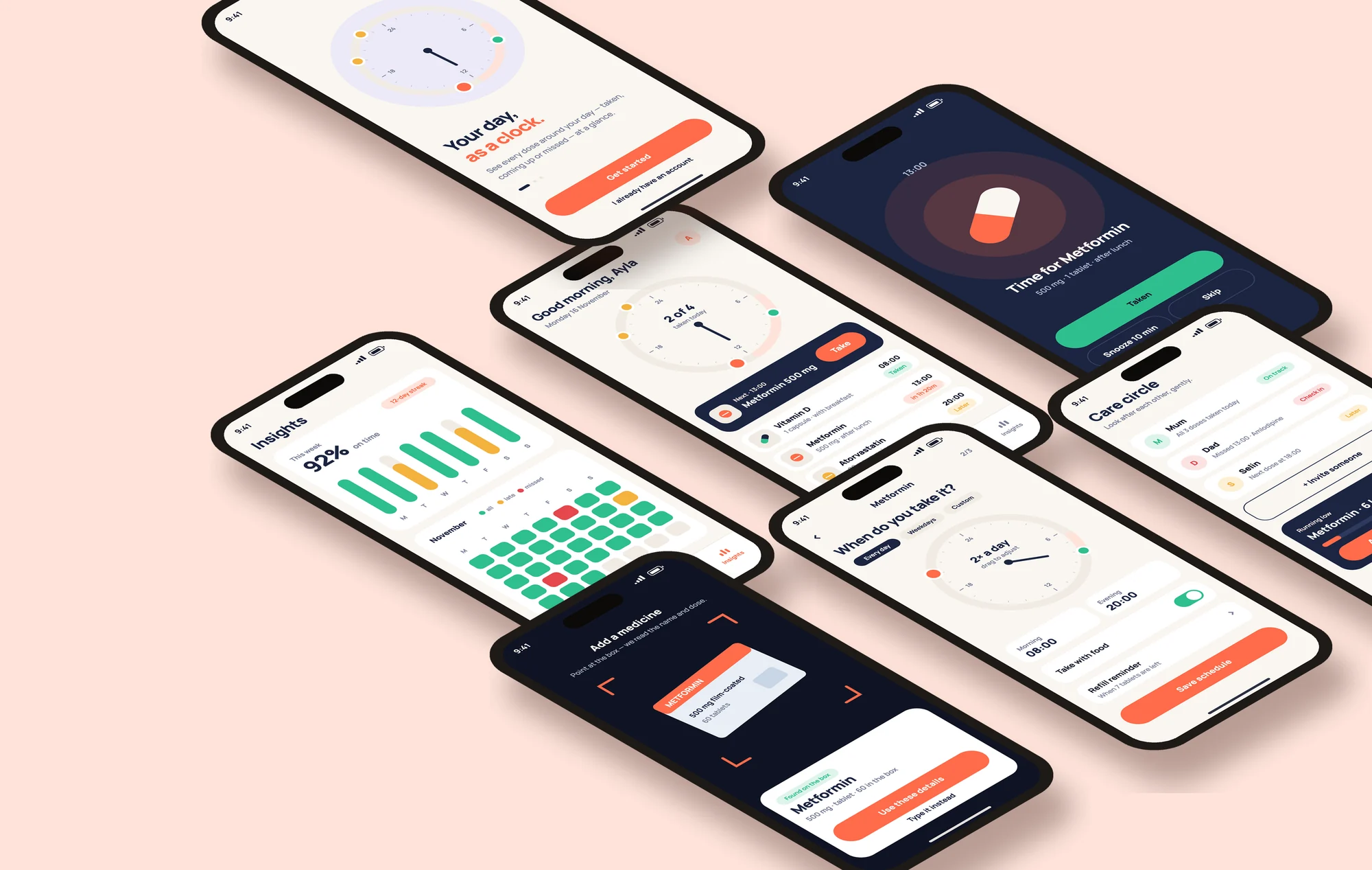
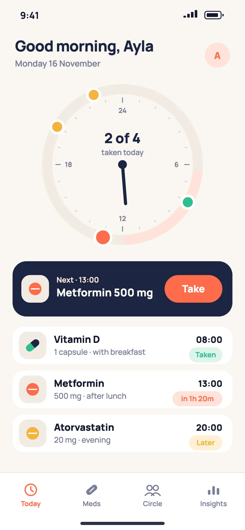
The Today screen puts all 24 hours on one dial. Taken doses turn mint, the next one is coral, and a card underneath counts down to it.
Add a medicine in seconds
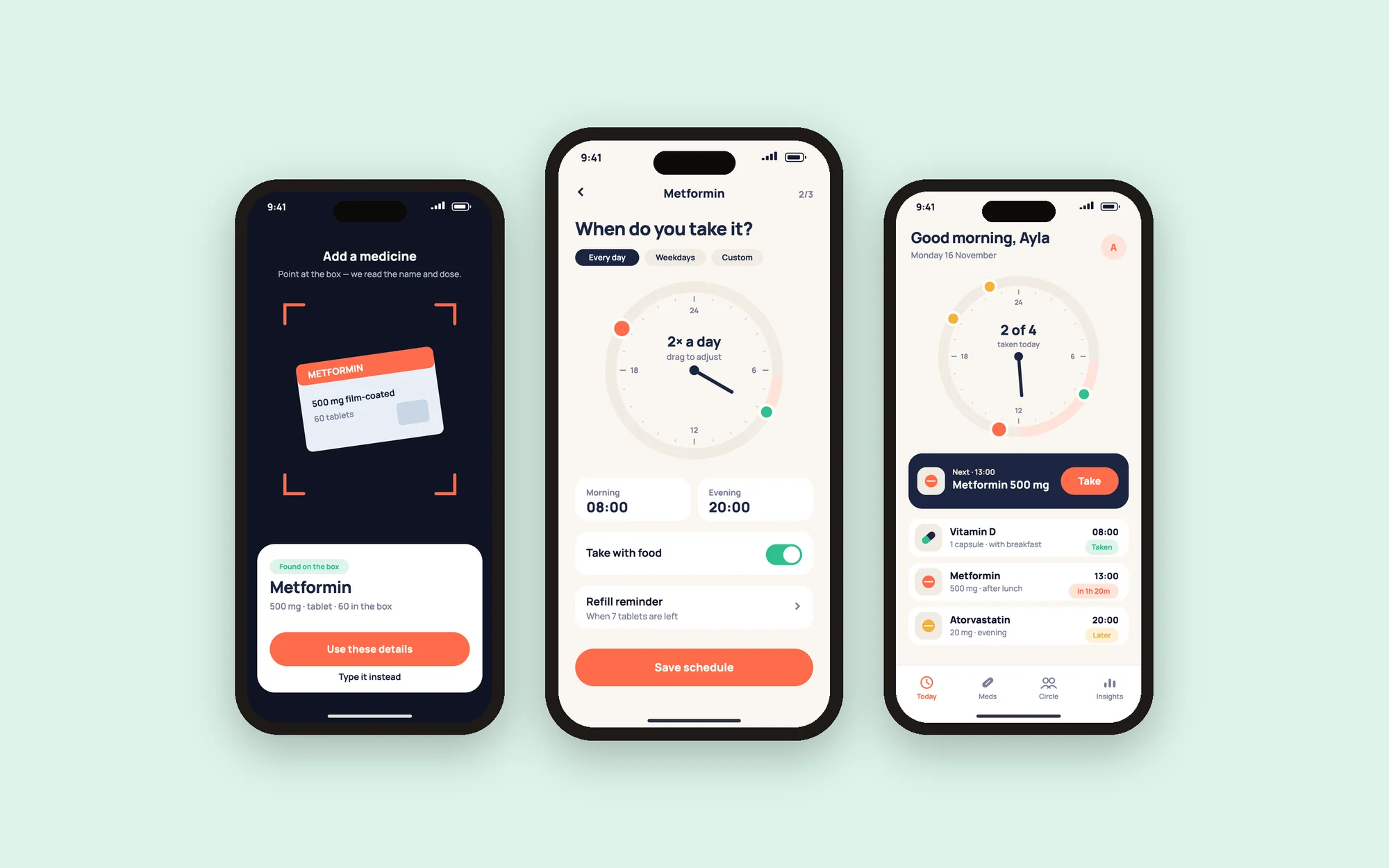
Point the camera at the box: oclo reads the name and the strength, suggests a schedule, and the dose lands on the clock.
Reminders you can answer
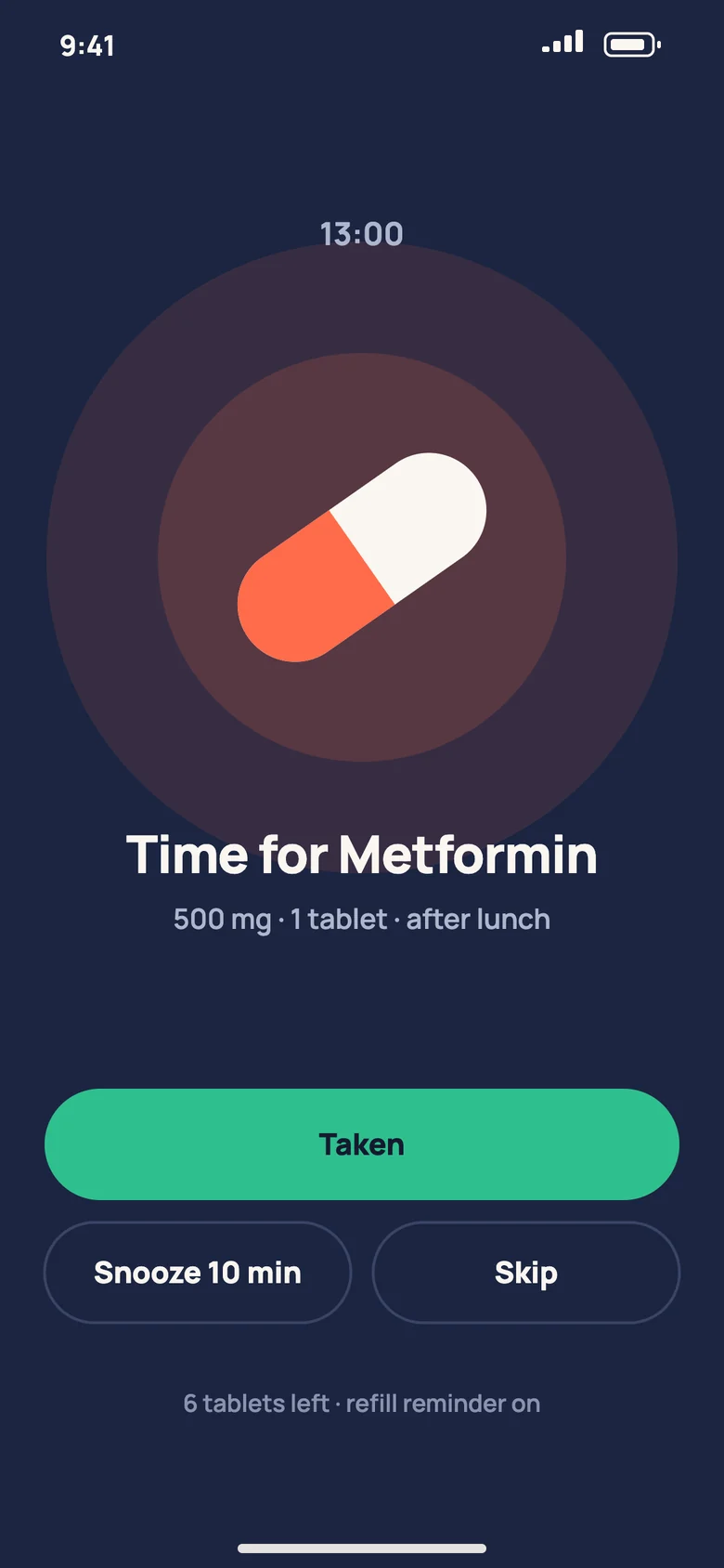
Every reminder has three honest answers — Taken, Snooze 10 min, Skip — so the history stays true and nothing silently slips through.
Care, together
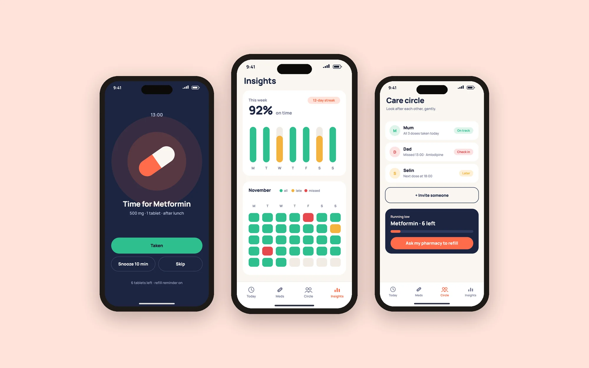
Insights show the month at a glance. A Care Circle lets family or a carer see a missed dose, and everyone gets a heads-up before a refill runs out.
First open
Three screens and you are in: a short promise, one question about your routine, and your day is already on the clock.
One editable design file
Every screen, the logo and the colour styles are layered, editable designs with named groups — ready to open in Figma and hand over.
Next project